The P&L Calendar just got a significant update. Weekly summaries, a full year overview, and expandable month views are now live — giving you a much clearer picture of your trading performance across time.
Here's everything that's new and how to use it.
Weekly Summary Column
Every week in the calendar now ends with a summary column on the right side. At a glance you can see the week's total P&L, how many trades you took, and your win/loss breakdown — without clicking anything.
Green means a profitable week. Red means a losing one. If you took no trades that week, the cell stays empty. It sounds simple, but seeing your weekly result sitting right next to the individual days changes how you read the calendar. Instead of mentally adding up Monday through Friday yourself, the number is already there.
This matters more than it might seem. Most traders think in terms of individual trades or individual days. The weekly view catches patterns that daily data obscures — like consistently giving back gains on Fridays, or always recovering mid-week after a bad Monday. Those patterns are invisible until you see them summarised at the week level.
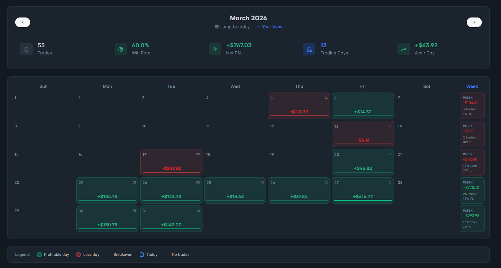 The weekly summary column on the right side of every row — total P&L, trades, and W/L at a glance
Year View
The new Year View button sits next to "Jump to today" in the calendar header. Click it and the entire layout switches to a 12-month overview of your trading year.
Monthly P&L bar chart
At the top of the year view, a bar chart shows all 12 months side by side. Green bars are profitable months, red bars are losing months. The height of each bar is proportional to the magnitude of the P&L — so your best and worst months stand out immediately.
This is one of the most useful single views you can have as a trader. It answers the question most traders can't actually answer without digging through spreadsheets: which month was genuinely your best? Was Q1 better than Q3? Did you improve from the first half of the year to the second?
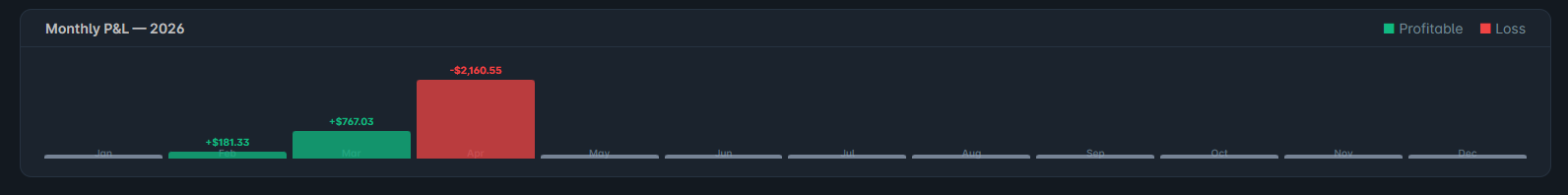 The monthly bar chart — 12 months side by side, green for profitable, red for losing
Mini-month grid
Below the bar chart, all 12 months are shown as compact cards in a 3×4 grid. Each card shows:
- The month name and total P&L
- Trade count and win/loss breakdown
- A dot grid showing every day of the month — green dots for profitable days, red for losing days, grey for days with no trades
The dot grid is particularly useful. In one glance you can see whether your profitable months came from consistent daily gains or from a handful of big days surrounded by losses. Those are very different trading styles with very different risk profiles, and the dot pattern makes it obvious which one you are.
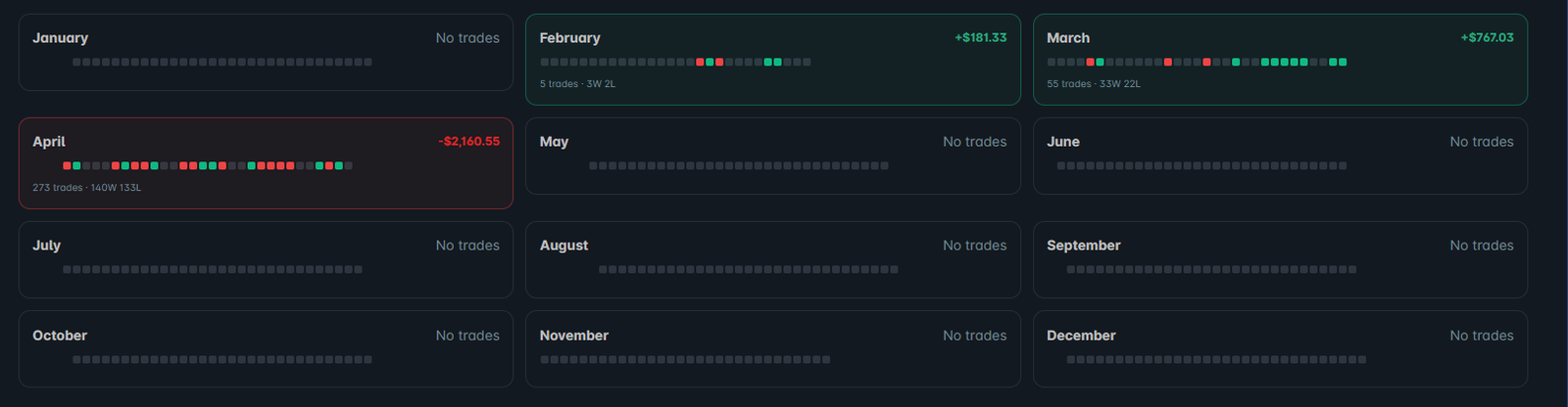 The 12-month mini grid — each card shows the dot pattern, total P&L, and trade breakdown
Expand Any Month
Click any month card — or its bar in the chart — and it expands inline below the card. The full calendar grid opens with all the detail you're used to: daily P&L, trade counts, the weekly summary column, and the month stats row at the top.
Click a different month and it collapses the first one and expands the new one. Click the same month again and it closes. No page reloads, no losing your place in the year view.
This means you can stay in year view and inspect individual months without losing the broader context. You can see that October was your worst month, expand it, find that you had three catastrophic Tuesdays, and immediately know what to investigate — all without leaving the screen.
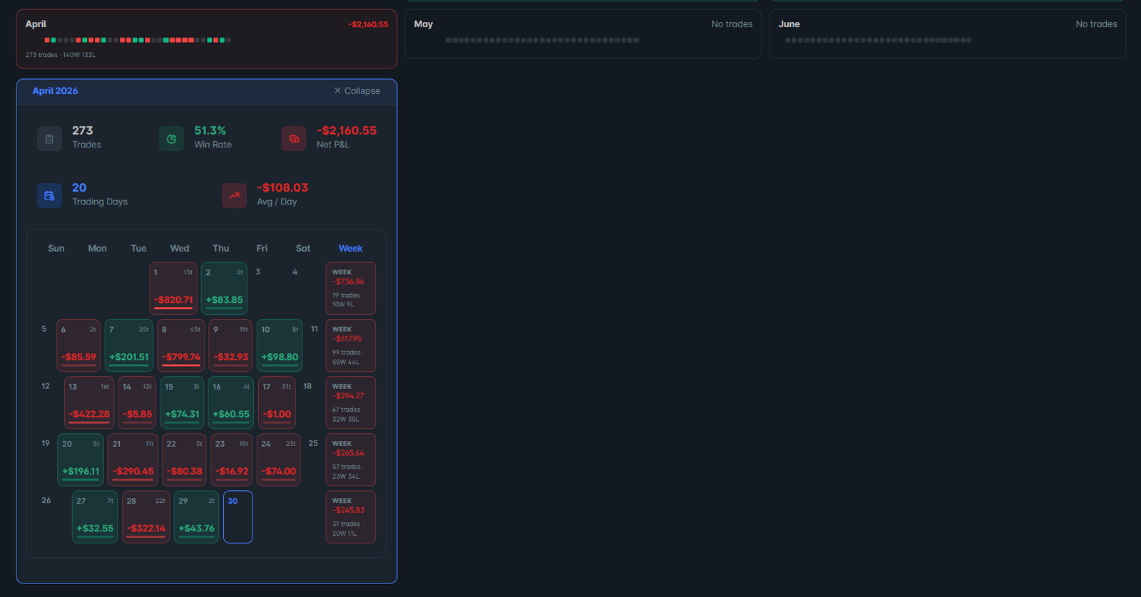 Click any month to expand it inline — the full calendar grid opens without leaving the year view
How to Use It
The year view is most useful as a monthly review tool rather than something you check daily. A good habit is to open it on the first of each month and spend five minutes with it:
- Look at the bar chart — is the overall trend improving or declining?
- Find your worst month and expand it — what happened that week or those days?
- Compare your dot patterns across months — are you consistently profitable or relying on a few big days?
- Check your weekly summaries — is there a day of week pattern in your losing weeks?
This kind of review takes less than ten minutes and produces more useful insight than reviewing individual trades, because it forces you to look at patterns rather than noise.
Available Now
The updated calendar is live for all SpotTradeJournal users. Open the P&L Calendar from the left sidebar and click Year View to try it. The weekly summary column appears automatically in the standard month view — nothing to enable.
If you don't have an account yet, start your free 7-day trial — no credit card required. The calendar, analytics, trade journal, and all other features are included from day one.